本文共 5214 字,大约阅读时间需要 17 分钟。
目录

Matplotlib 是一个 Python 的 2D绘图库,通过 Matplotlib,开发者可以仅需要几行代码,便可以生成绘图,直方图,功率谱,条形图,错误图,散点图等。
-
用于创建出版质量图表的绘图工具库
-
目的是为Python构建一个Matlab式的绘图接口
-
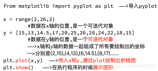
import matplotlib.pyplot as plt -
pyploy模块包含了常用的matplotlib API函数

figure
-
Matplotlib的图像均位于figure对象中
-
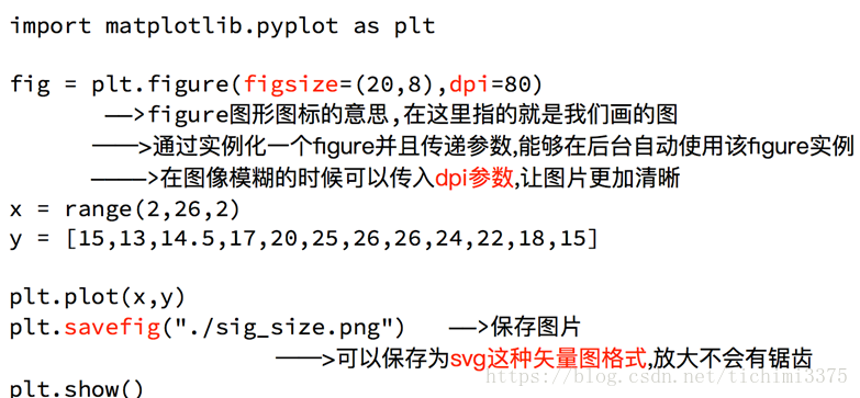
创建figure:
fig = plt.figure()
示例代码:
# 引入matplotlib包import matplotlib.pyplot as pltimport numpy as np%matplotlib inline #在jupyter notebook 里需要使用这一句命令# 创建figure对象fig = plt.figure()
运行结果:
subplot
fig.add_subplot(a, b, c)
-
a,b 表示将fig分割成 a*b 的区域
-
c 表示当前选中要操作的区域,
-
注意:从1开始编号(不是从0开始)
-
plot 绘图的区域是最后一次指定subplot的位置 (jupyter notebook里不能正确显示)
示例代码:
# 指定切分区域的位置ax1 = fig.add_subplot(2,2,1)ax2 = fig.add_subplot(2,2,2)ax3 = fig.add_subplot(2,2,3)ax4 = fig.add_subplot(2,2,4)# 在subplot上作图random_arr = np.random.randn(100)#print random_arr# 默认是在最后一次使用subplot的位置上作图,但是在jupyter notebook 里可能显示有误plt.plot(random_arr)# 可以指定在某个或多个subplot位置上作图# ax1 = fig.plot(random_arr)# ax2 = fig.plot(random_arr)# ax3 = fig.plot(random_arr)# 显示绘图结果plt.show()
运行结果:

折线图:以折线的上升或下降来表示统计数量的增减变化的统计图
特点:能够显示数据的变化趋势,反映事物的变化情况。(变化)
直方图:由一系列高度不等的纵向条纹或线段表示数据分布的情况。
一般用横轴表示数据范围,纵轴表示分布情况。
特点:绘制连续性的数据,展示一组或者多组数据的分布状况(统计)
条形图:排列在工作表的列或行中的数据可以绘制到条形图中。
特点:绘制连离散的数据,能够一眼看出各个数据的大小,比较数据之间的差别。(统计)
散点图:用两组数据构成多个坐标点,考察坐标点的分布,判断两变量
之间是否存在某种关联或总结坐标点的分布模式。
特点:判断变量之间是否存在数量关联趋势,展示离群点(分布规律)
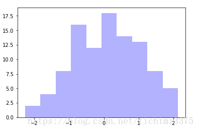
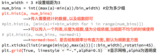
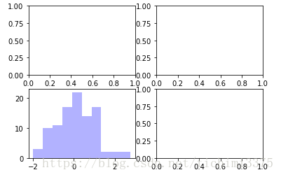
直方图:hist
示例代码:
import matplotlib.pyplot as pltimport numpy as npplt.hist(np.random.randn(100), bins=10, color='b', alpha=0.3)plt.show()
运行结果:


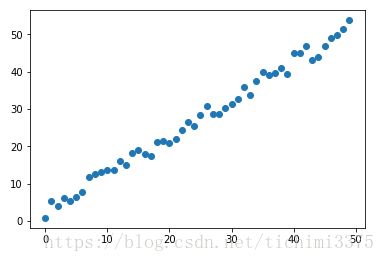
散点图:scatter
示例代码:
import matplotlib.pyplot as pltimport numpy as np# 绘制散点图x = np.arange(50)y = x + 5 * np.random.rand(50)plt.scatter(x, y)plt.show()
运行结果: 
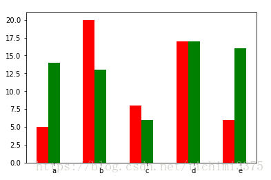
柱状图:bar
示例代码:
import matplotlib.pyplot as pltimport numpy as np# 柱状图x = np.arange(5)y1, y2 = np.random.randint(1, 25, size=(2, 5))width = 0.25ax = plt.subplot(1,1,1)ax.bar(x, y1, width, color='r')ax.bar(x+width, y2, width, color='g')ax.set_xticks(x+width)ax.set_xticklabels(['a', 'b', 'c', 'd', 'e'])plt.show()
运行结果:

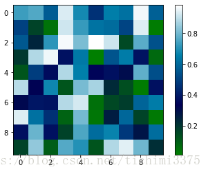
矩阵绘图:plt.imshow()
- 混淆矩阵,三个维度的关系
示例代码:
import matplotlib.pyplot as pltimport numpy as np# 矩阵绘图m = np.random.rand(10,10)print(m)plt.imshow(m, interpolation='nearest', cmap=plt.cm.ocean)plt.colorbar()plt.show()
运行结果:
[[ 0.92859942 0.84162134 0.37814667 0.46401549 0.93935737 0.0344159 0.56358375 0.75977745 0.87983192 0.22818774] [ 0.88216959 0.43369207 0.1303902 0.98446182 0.59474031 0.04414217 0.86534444 0.34919228 0.53950028 0.89165269] [ 0.52919761 0.87408715 0.097871 0.78348534 0.09354791 0.3186 0.25978432 0.48340623 0.1107699 0.14065592] [ 0.90834516 0.42377475 0.73042695 0.51596826 0.14154431 0.22165693 0.64705882 0.78062873 0.55036304 0.40874584] [ 0.98853697 0.46762114 0.69973423 0.7910757 0.63700306 0.68793919 0.28685306 0.3473426 0.17011744 0.18812329] [ 0.73688943 0.58004874 0.03146167 0.08875797 0.32930191 0.87314734 0.50757536 0.8667078 0.8423364 0.99079049] [ 0.37660356 0.63667774 0.78111565 0.25598593 0.38437628 0.95771051 0.01922366 0.37020219 0.51020305 0.05365718] [ 0.87588452 0.56494761 0.67320078 0.46870376 0.66139913 0.55072149 0.51328222 0.64817353 0.198525 0.18105368] [ 0.86038137 0.55914088 0.55240021 0.15260395 0.4681218 0.28863395 0.6614597 0.69015592 0.46583629 0.15086562] [ 0.01373772 0.30514083 0.69804049 0.5014782 0.56855904 0.14889117 0.87596848 0.29757133 0.76062891 0.03678431]]

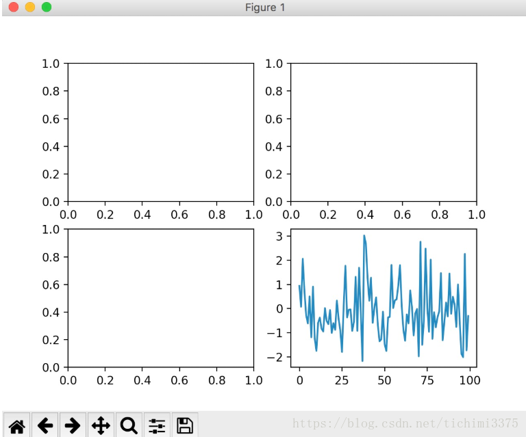
plt.subplots()
-
同时返回新创建的
figure和subplot对象数组 -
生成2行2列subplot:
fig, subplot_arr = plt.subplots(2,2) -
在jupyter里可以正常显示,推荐使用这种方式创建多个图表
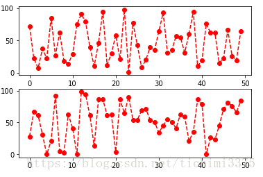
示例代码:
import matplotlib.pyplot as pltimport numpy as npfig, subplot_arr = plt.subplots(2,2)# bins 为显示个数,一般小于等于数值个数subplot_arr[1,0].hist(np.random.randn(100), bins=10, color='b', alpha=0.3)plt.show()
运行结果: 
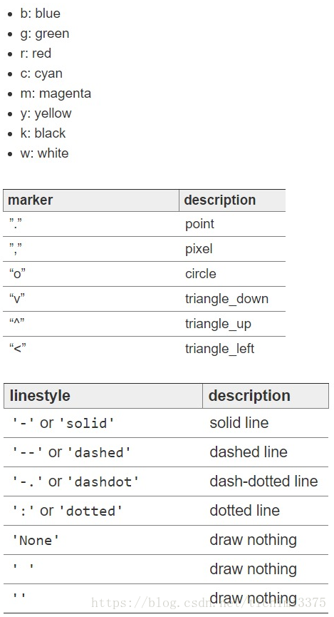
颜色、标记、线型
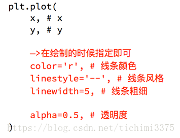
- ax.plot(x, y, ‘r--’)
等价于ax.plot(x, y, linestyle=‘--’, color=‘r’)
示例代码:
import matplotlib.pyplot as pltimport numpy as npfig, axes = plt.subplots(2)axes[0].plot(np.random.randint(0, 100, 50), 'ro--')# 等价axes[1].plot(np.random.randint(0, 100, 50), color='r', linestyle='dashed', marker='o')
运行结果:
[<matplotlib.lines.Line2D at 0x11a901e80>]

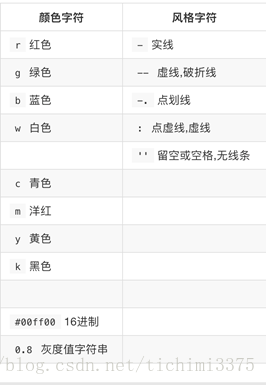
- 常用的颜色、标记、线型

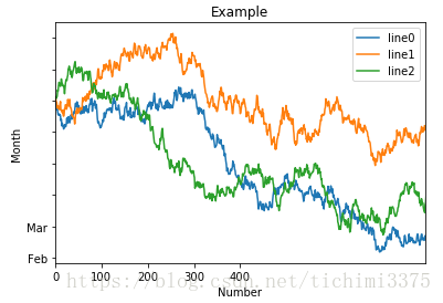
刻度、标签、图例
-
设置刻度范围
plt.xlim(), plt.ylim()
ax.set_xlim(), ax.set_ylim()
-
设置显示的刻度
plt.xticks(), plt.yticks()
ax.set_xticks(), ax.set_yticks()
-
设置刻度标签
ax.set_xticklabels(), ax.set_yticklabels()
-
设置坐标轴标签
ax.set_xlabel(), ax.set_ylabel()
-
设置标题
ax.set_title()
-
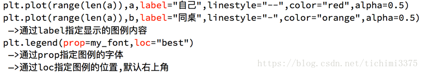
图例
ax.plot(label=‘legend’)
ax.legend(), plt.legend()
loc=‘best’:自动选择放置图例最佳位置
示例代码:
import matplotlib.pyplot as pltimport numpy as npfig, ax = plt.subplots(1)ax.plot(np.random.randn(1000).cumsum(), label='line0')# 设置刻度#plt.xlim([0,500])ax.set_xlim([0, 800])# 设置显示的刻度#plt.xticks([0,500])ax.set_xticks(range(0,500,100))# 设置刻度标签ax.set_yticklabels(['Jan', 'Feb', 'Mar'])# 设置坐标轴标签ax.set_xlabel('Number')ax.set_ylabel('Month')# 设置标题ax.set_title('Example')# 图例ax.plot(np.random.randn(1000).cumsum(), label='line1')ax.plot(np.random.randn(1000).cumsum(), label='line2')ax.legend()ax.legend(loc='best')#plt.legend() 运行结果: <matplotlib.legend.Legend at 0x11a4061d0> 
matplotlib基本要点
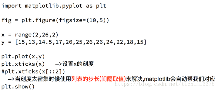
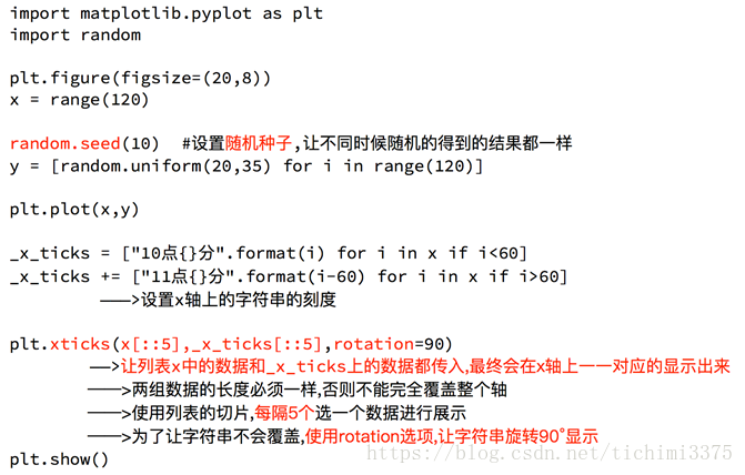
设置图片大小
调整X或者Y轴上的刻度
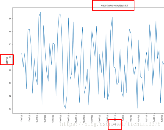
设置中文显示
为什么无法显示中文:
matplotlib默认不支持中文字符,因为默认的英文字体无法显示汉字
查看linux/mac下面支持的字体:fc-list à查看支持的字体
fc-list :lang=zh à查看支持的中文(冒号前面有空格)
那么问题来了:如何修改matplotlib的默认字体?
通过matplotlib.rc可以修改,具体方法参见源码(windows/linux)
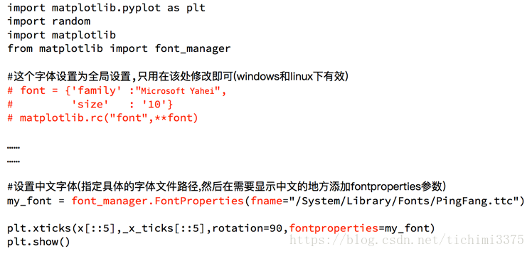
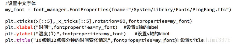
通过matplotlib 下的font_manager可以解决(windows/linux/mac)
给图像添加描述信息
自定义绘制图形的风格
为每条线添加图例